
Biatec Laser Technology focuses on groundbreaking technological solutions with global relevance. As part of the company’s modernisation, the client also requested a logo redesign that would reflect the innovation, dynamism, and credibility of a company specialising in the research, development, and production of laser equipment.
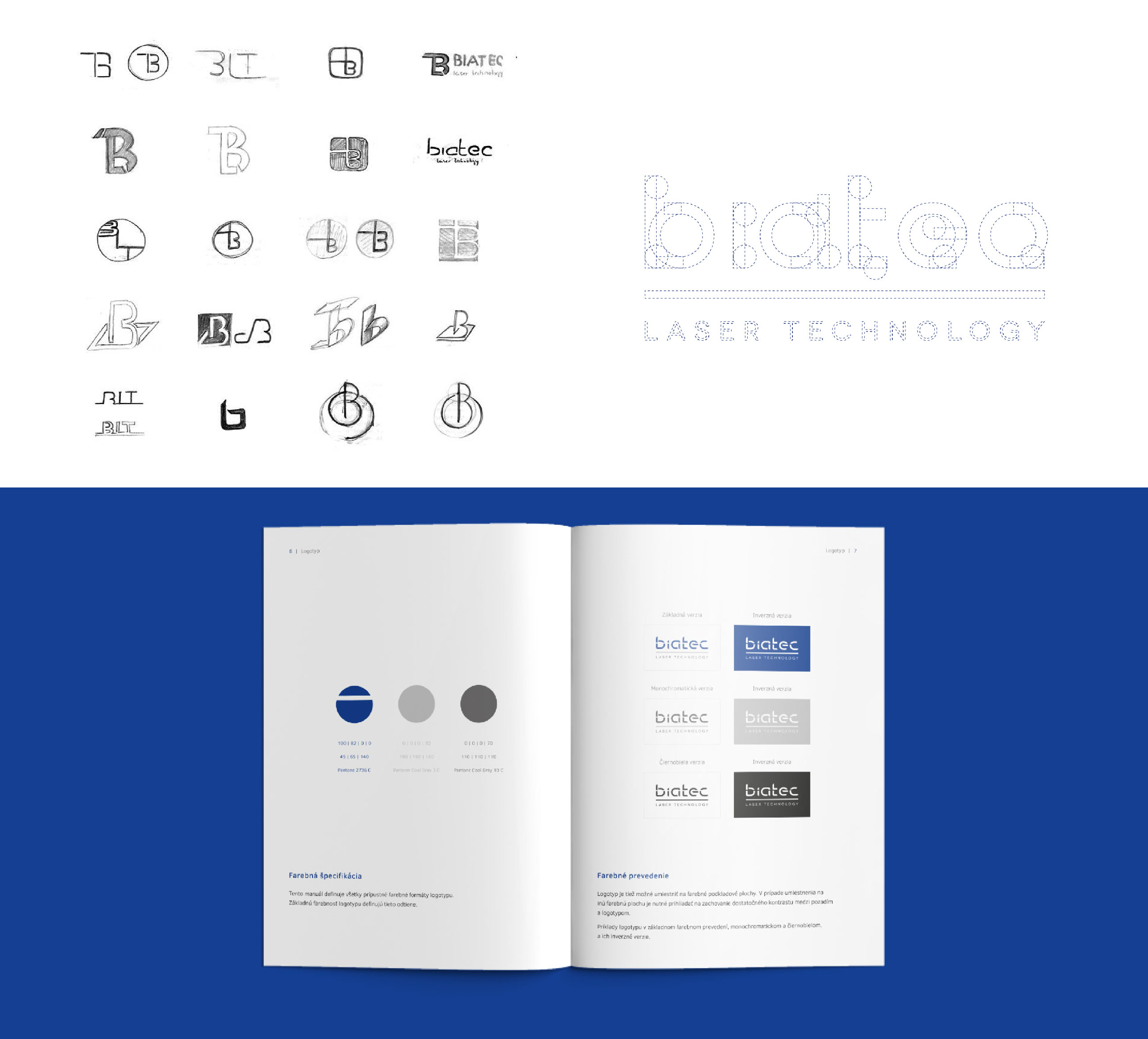
The new design is centred around the laser as the key element of the production process. We decided to integrate this motif directly into the company name, creating a stronger connection between the visual concept and the brand itself.
The blue used in the logo represents credibility and quality. It is complemented by metallic grey, symbolising precision and durability. By combining the laser motif with the selected colour palette, we created a visual identity that met both the client’s brief and the intended brand message.
Interested in creating an outstanding and functional corporate identity? We will be happy to help.



.png)