Moje fitko is a women-only fitness club in Bratislava. Its team aims not only to help clients achieve or maintain their ideal figure, but also to create a welcoming, family-like atmosphere where everyone can feel comfortable and supported.
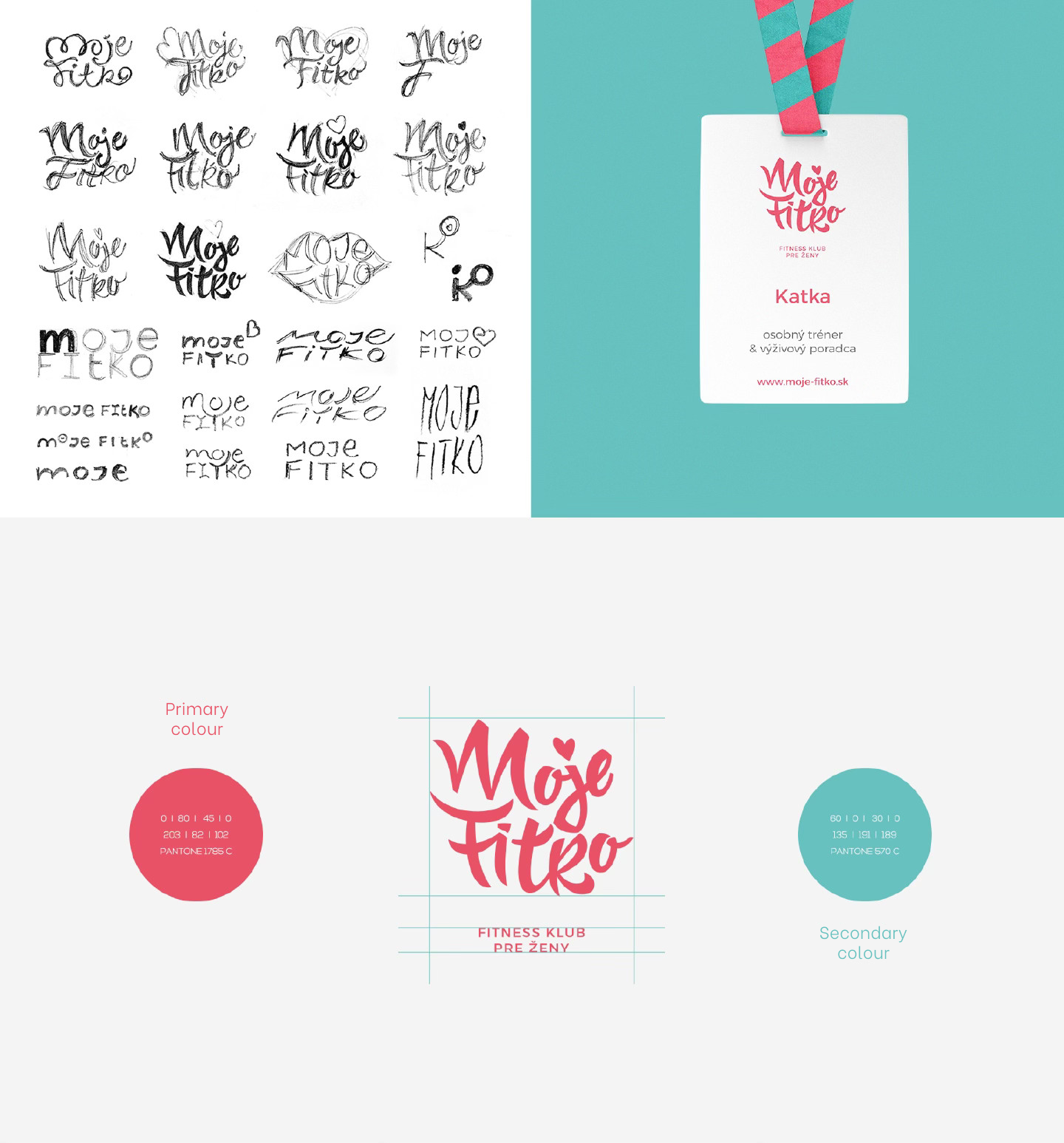
The client’s only specific requirement for the logo was the colour palette.
When designing the logo, we wanted to capture softness, femininity, and the sense of movement and energy associated with training.
We chose a handwritten typeface with flowing strokes that suggest motion. The logo is complemented by a small heart replacing the dot above the letter J, symbolising a love for a healthy lifestyle, the fitness club itself, and, naturally, femininity.
Together, these elements form a simple and versatile visual symbol that works well across different applications.
The third and final element of the logo is the tagline, which can be used optionally depending on the context.
Interested in creating an outstanding and functional corporate identity? We will be happy to help.



.png)