
CRIF approached us to create a logo for Platby pod kontrolou, a service designed to remind users about upcoming invoice payments. The final colour palette of the logo was derived from the corporate colours of its parent company, CRIF.
For the design, we chose to focus on simplicity.
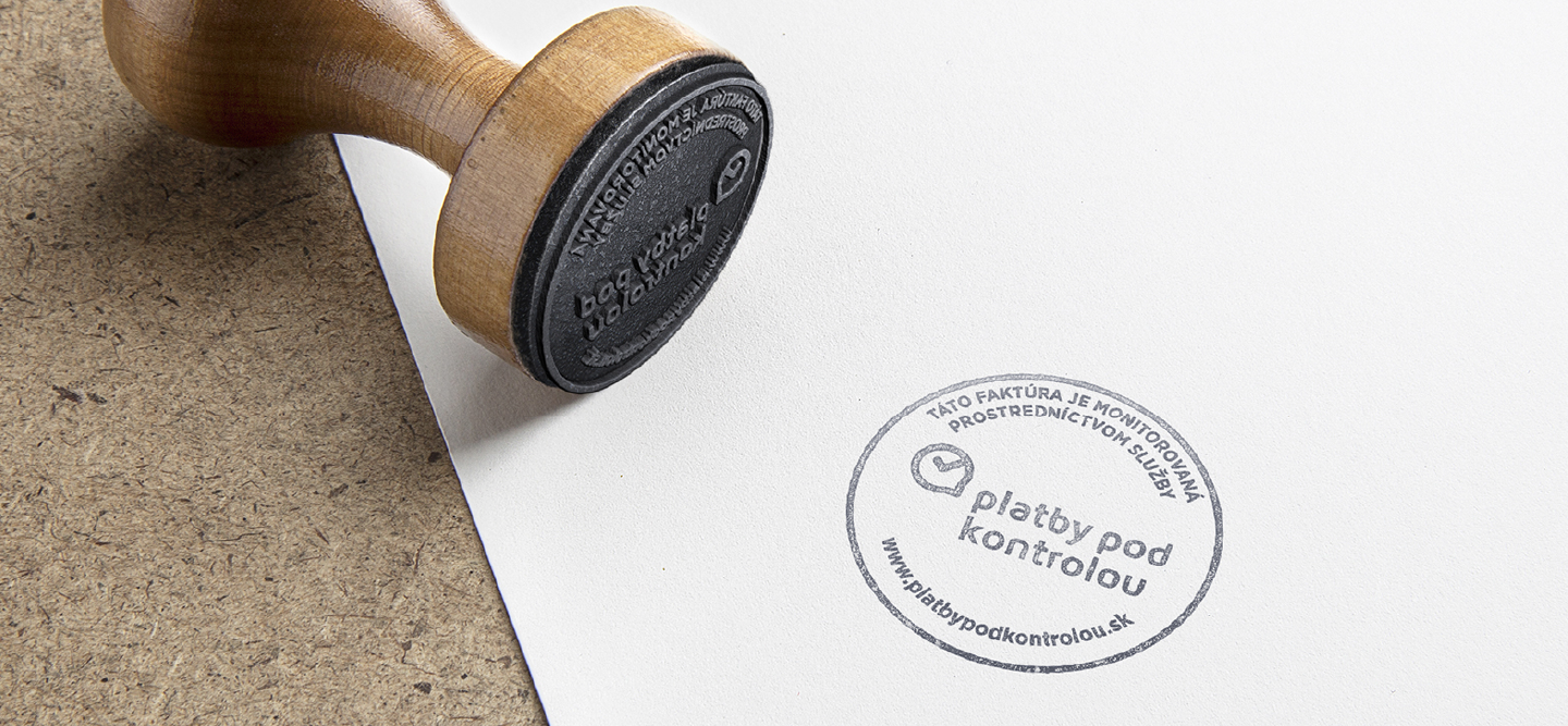
We divided the logo into three key elements. The first is a sans-serif wordmark. The second is a symbol combining visual references to overdue payments, notifications, and satisfaction. Together, these elements form a simple and versatile icon that works effectively across different applications.
The third and final element is the tagline, which can be used optionally depending on the context.
Interested in creating an outstanding and functional corporate identity? We will be happy to help.



.png)