REBUZ is a young real estate company providing premium services in the sale, purchase, and rental of properties.
The client approached us to create a corporate identity that would clearly reflect the nature of the business and make the brand immediately recognisable within the real estate sector.
One of the key requirements was to avoid typical real estate symbols such as doors, houses, keys, or similar clichés. A rare and welcome act of restraint in branding.
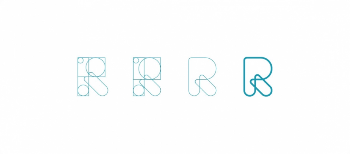
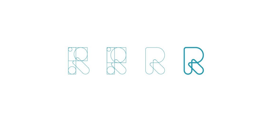
The concept was inspired by the often winding and complicated journey towards finding the ideal home. The logo was designed to symbolise making that journey easier.
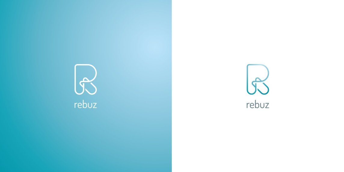
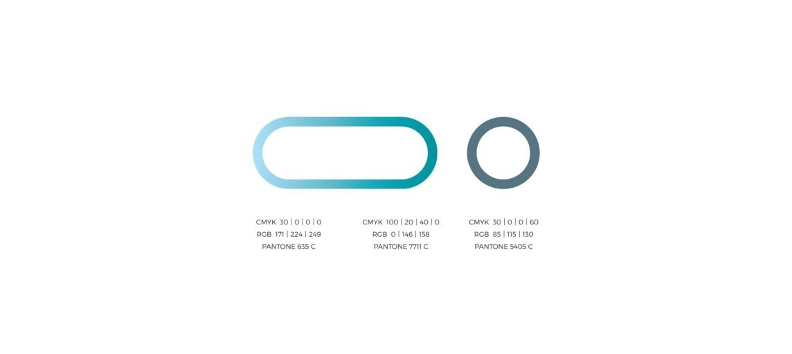
Its dominant element is the letter “R” stylised as a road. We used a gradient to create a subtle reflective effect while also emphasising the dynamism of the symbol itself.
A simple typeface was chosen to complement the strong visual element without competing with it. Together, these components create a distinctive identity that meets both the client’s brief and the functional needs of the brand.
Interested in creating an outstanding and functional corporate identity? We will be happy to help.





.png)